National Decarbonisation Pathways - Modelled in Python & PowerBI
This project was the focus of my MScR at the University of Bristol, and was continued during my time as a Carbon Analyst at the University of Bath, its core objectives are as follows:
Design a user-friendly PowerBI dashboard capable of displaying decarbonisation pathways for Great Britain including:
A. All generation data (excluding interconnectors) at a 5-minute resolution to determine peaks and dips in renewables
B. Predicted demand, derived from existing demand data combined with predictive models generated by NESO’s Future Energy Scenarios and academic research
C. Battery & Hydrogen storage, showcasing charging and dis-charging for below-target generation mitigation
D. Capability of allowing users to change through the dashboard: individual generators GW grid contributions, demand and battery & hydrogen storage capacities, instantly updating relevant graphs to showcase the impacts on the pathways.
Generation Data
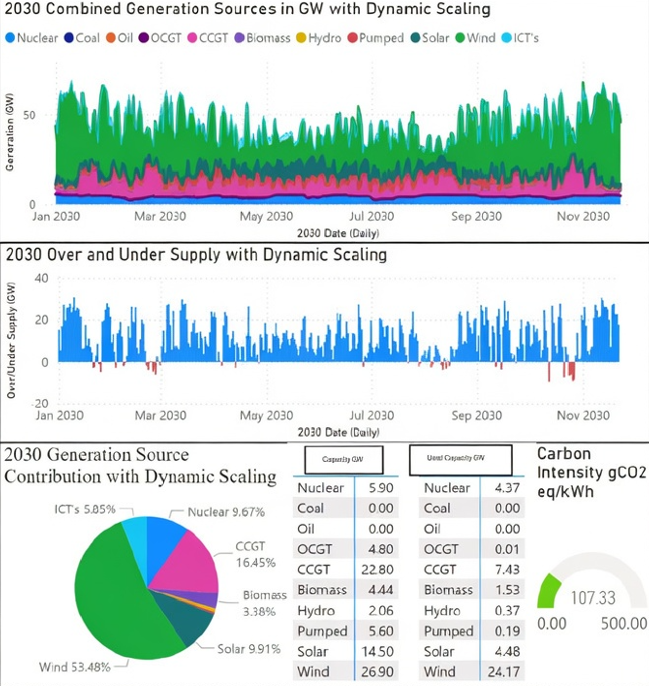
Figure 1. A snapshot of the PowerBI dashboard, displaying 2030 data for a predicted future scenario. This figure showcases the different graphs displayed to the user, including: A Generation in GW graph for each generation source, A Over & Under Supply graph showing periods when the grid is unable to supply its own needs. A pie chart breaking down the mix of generations, two tables comparing installed capacity to used capacity for each generation source and finally a carbon intensity meter showing the combined CO2eq for all the generation sources combined.
This project designed from scratch a dashboard in PowerBI, capable of using open source data from Gridwatch and ElectricityMaps to model different transition pathway scenarios forecasting the UK’s electricity grid transition to a low carbon future between the years 2023 to 2050. The project has successfully created this dashboard and modelled 11 different scenarios where Scenario 3c is the final 2050 projection. The model takes into account renewable penetration, nuclear baseload capacity, battery and hydrogen storage in addition to fossil fuel decommissioning.
The available literature, providing a comprehensive argument for the parameters defined in the methodology, encompasses a wide array of topics including: electricity grid system design, different generation sources, carbon capture and storage, demand modelling, battery and hydrogen storage, reviews of 2011 to 2023 data and a comprehensive evaluation of two separate existing predictive models from the University of Bath and the National Grid. These all provide the foundations upon which this projects parameters are defined for each scenario iteration.
This project finalises a series of scenarios, each modelled in the PowerBI dashboard and with an analysis completed for each. This analysis creates a series of rules for the next iteration, these changes are updated in a flowchart showcasing this projects scenario pathways. The final model, Scenario 3 for 2050, has excellent properties including a reduced carbon intensity value of 19.79 gCO2eq/kWh compared with 133.27 gCO2eq/kWh for 2023. An increase in renewable penetration of 59.62% vs 33.83%, and a nuclear baseload capacity of 36.03% vs 17.31%, in addition to 50GW of battery storage and 70GW of hydrogen storage. All of these models take into account, a predicted growing demand, forecasted for the UK at rate of 2.9% per year until 2050. Overall this project has succeeded in creating a PowerBI dashboard capable of modelling different scenario’s from 2023 to 2050, each of which improve upon the last trending towards a UK electricity grid in 2050 with as low a carbon intensity value as possible whilst conforming to the rules set out in the literature review and methodology.
Battery & Hydrogen Storage Data
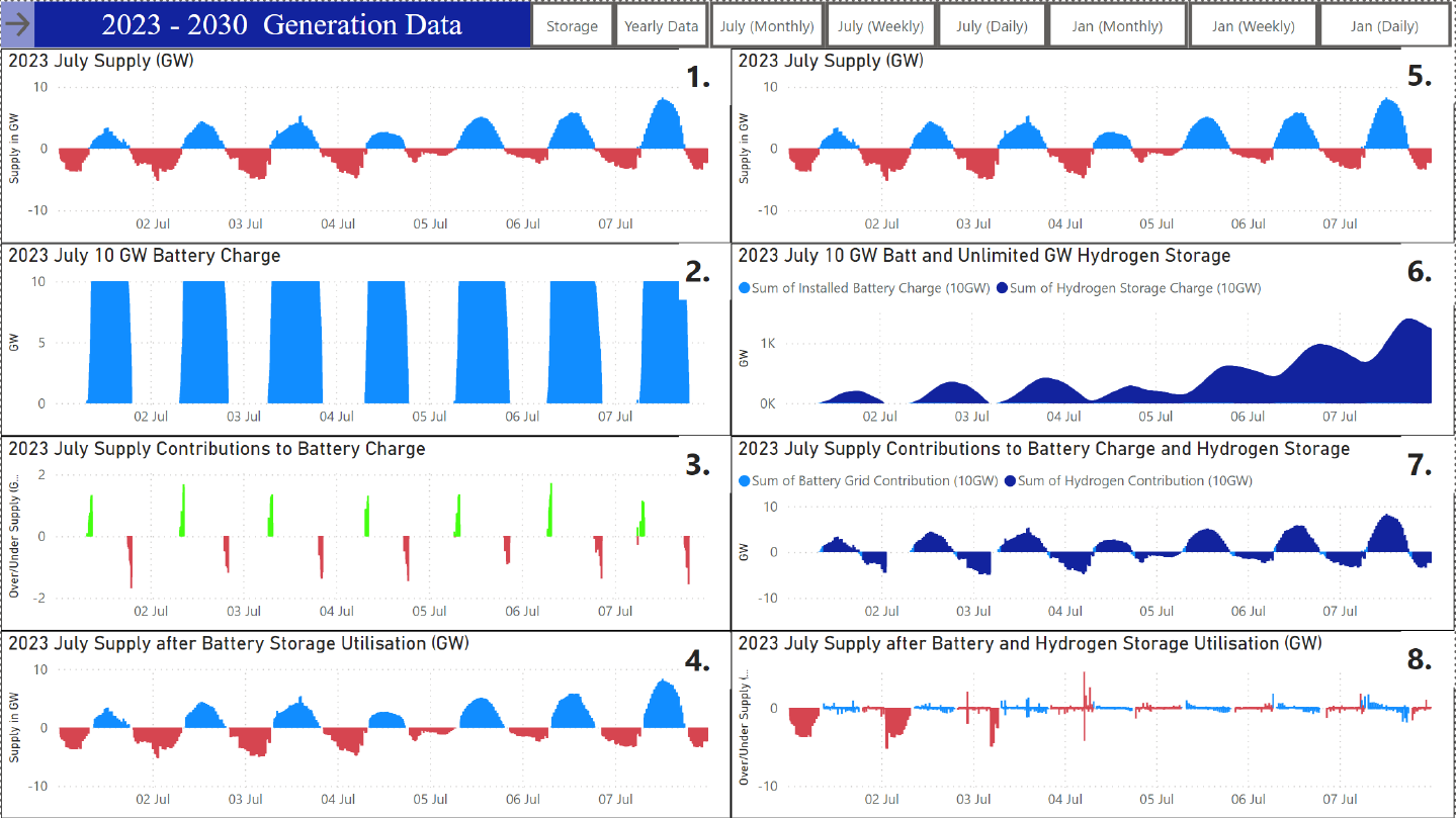
Figure 2. An additional component of the dashboard, capable of displaying battery & hydrogen storage information for the user, clearly demonstrating periods of charging and dis-charging to mitigate droughts in generation ensuring demand is fully met throughout the period displayed. The use is able to adjust the capacities of both the battery and hydrogen storage, to create bespoke scenarios, ensuring that a wide range of possible future energy scenarios are available for modelling.
Graphs 1. - This is the initial over and under supply for the selected period measured in GW without battery or hydrogen storage included, the blue shaded areas represent over supply while the red shaded areas represent under supply.
Graph 2. - This shows the charged capacity of the battery storage, for this example a battery storage with a total capacity of 10 GW has been chosen. The batteries are charged during periods of over supply and discharged in periods of under supply, these are shown in Graph 1.
Graph 3. - This graph shows the grids contribution to the charging of the battery storage, green shaded areas are periods of charging until maximum battery capacity is reached and red shaded areas are periods of discharge until the batteries capacity has reached 0.
Graph 4. - This graph shows a newly updated over/under supply version of Graph 1. with included battery storage. This graph is designed to be used as a comparison with Graph 1. to give the user insight into the improvements battery storage has had on the management of over and under supply.
Graph 5. - This is again the initial supply, the same as Graph 1. but it will be used for a later comparison with Graph 8. which includes battery and hydrogen storage.
Graph 6. - This graph shows the capacity charge of both the included battery storage from Graph 2. which is 10 GW for this example and hydrogen storage, which for this example has an unlimited capacity. This is measured in GW. This graph is used to show the user how batteries are charged and discharged first before the use of hydrogen and for the examination of periods where under supply may only require battery storage.
Graph 7. - This graph shows the grids contribution to the charging of both the battery storage and hydrogen storage. Light blue represents the charging and discharging periods of the batteries whilst the dark blue represents the charging and discharging of hydrogen.
Graph 8. - This is the final graph showing the updated supply for the selected period, with the inclusion of battery and hydrogen storage designed to mitigate over/under supply this graph can be compared to Graphs 1. and 5. to showcases periods where there could be improvements into the management of supply. This graph gives the user the basis for further recommendations and changes in later scenario modelling.
Results
The 11 scenarios generated in this PowerBI dashboard for this project are compared in Table 2, each scenario is iterative, building upon the previous scenarios findings regarding renewable generation % contributions, suitable storage capacities and realistic decarbonisation timelines. These iterative steps are summarised in Figure 3. Table 1 displays the final % contribution to each scenario for renewables and nuclear, with a calculated carbon intensity value, demonstrating the models ability to create by 2050 a nearly decarbonised Great Britain electricity network.
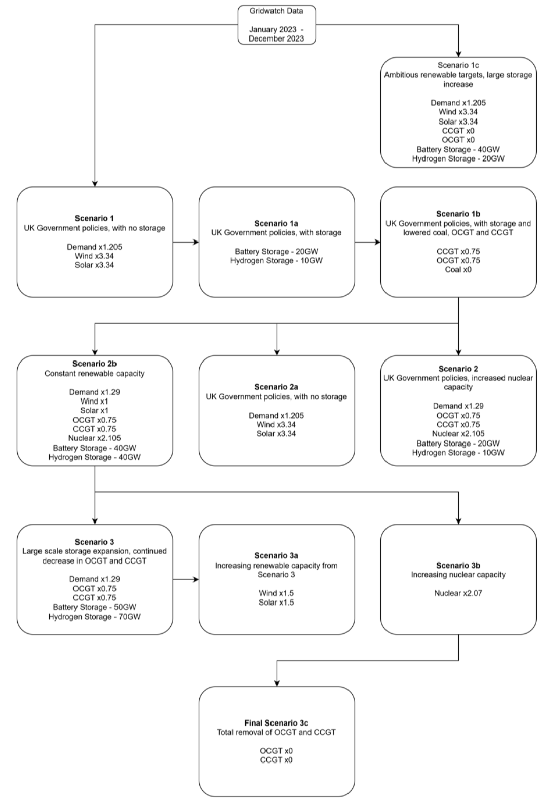
Figure 3. This is a flowchart designed to show the process of creating the different modelling scenarios and the parameters that defined each one separately. All modelling scenarios started by using the original data provided by Gridwatch. Models connected via an arrow are direct continuations of the linked model, giving a clear line of progression for the final model Scenario 3c. The line of progression was: Original Open Source Data - Scenario 1 - Scenario 1a - Scenario 1b - Scenario 2c - Scenario 3b - Scenario 3c. This pathway encompasses an entire 2023 to 2050 scenario.
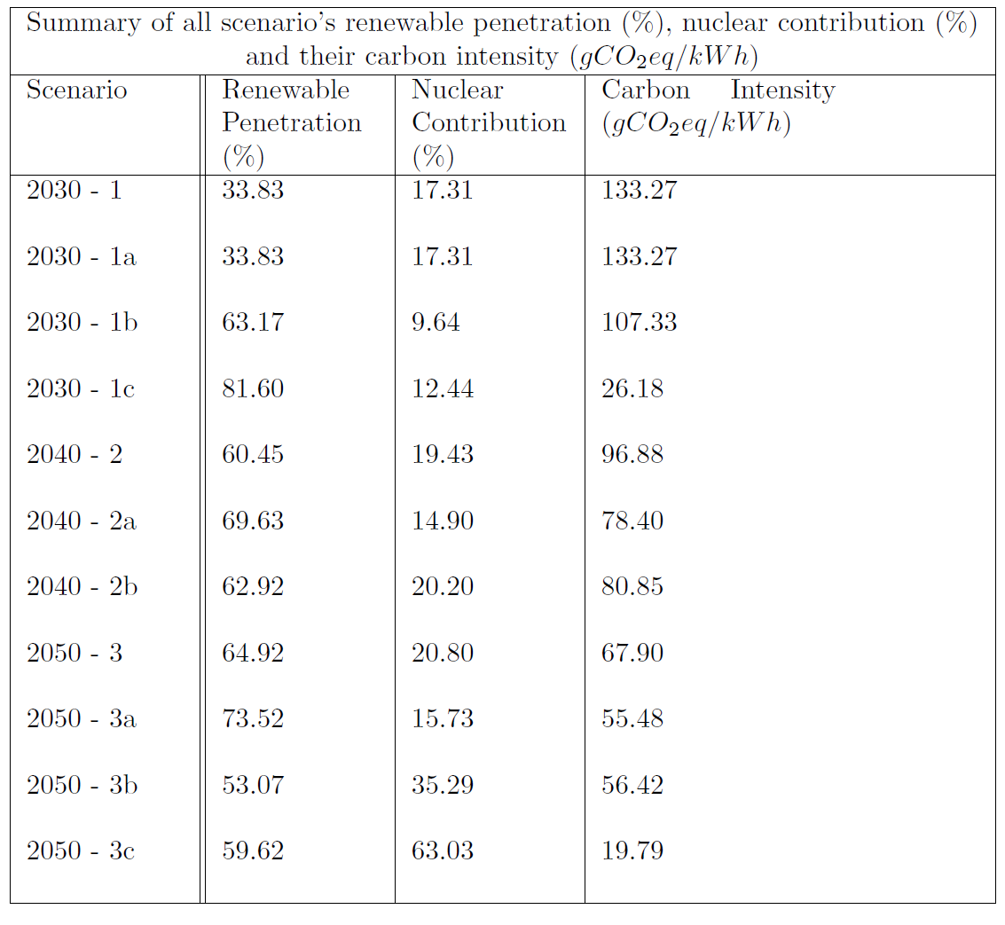
Table 1. All 11 scenarios and their subsequent % contribution to the grid from renewables and nuclear are presented, in addition to the final carbon intensity reading generated from open-source data provided by ElectricityMaps. From this data the calculation performed takes the GW contribution of each generation source, multiples it by its carbon intensity value and adds them all together to generate a final gCO2eq/kWh figure. Clearly displayed is the downward trajectory of grid carbon intensity as Great Britain shifts towards renewables, nuclear and energy storage.
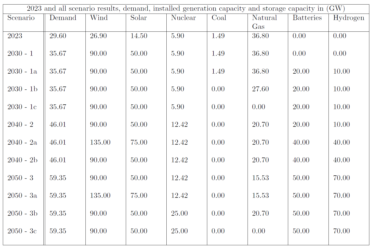
Table 2. The final results for all scenarios with the adjusted average GW contribution of wind, solar, nuclear, coal and natural gas in addition to the average GW contribution capacities of the battery and hydrogen storage. These values, in addition to the carbon intensity gCO2eq/kWh values provided from the scenarios are all compared with the transition pathways and National Grids Future Energy Scenarios in the discusson.
Conclusion
This project has successful designed from scratch a PowerBI dashboard capable allowing a user to display and manipulate the 2011 to 2023 Gridwatch and ElectricityMaps data to generate different electricity grid scenarios for 2023 to 2050 decarbonisation transition pathways. A total of 11 scenarios, 1 through to 3c, were successfully modelled using this dashboard and provided insight into the technical challenges associated with renewables, baseload power, flexible OCGT and CCGT plants, rising demand and the mitigation of energy surpluses or droughts through battery and hydrogen storage.
The literature reviewed for this project and the work done by the University of Bath on predictive transition path modelling, and the National Grid’s Future Energy Scenarios provided excellent material to base this projects parameters on. These sources provided this project with an evidence based grounding for the increasing renewable penetration and nuclear baseload power modelled in each scenario, in addition to evidence for the removal of CCGT, OCGT and coal power with no use of CCS or CHP plants. These restraints allowed for a clear decarbonisation pathway to be produced over the period 2023 to 2050, focused on using existing economically available and scalable technologies. The final scenario, Scenario 3c, modelled on the dashboard saw a large drop in its generation sources carbon intensity at 19 gco2eq/kWh compared with current 2023 value of 206.34 gCO2eq/kWh.
Once the modelling for this project had been completed, with as near to zero a carbon intensity value as possible achieved while maintaining grid energy demand stable, a comparison between the transition pathways produced by the University of Bath and the Future Energy Scenarios by the National Grid was undertaken. These comparisons highlighted the key differences between all three, notable differences occurred due to the perceived economic successfulness of carbon capture and storage systems. These systems at the time of writing are currently not economically viable for the UK’s generation infrastructure, and this project deemed using them, in addition to other future low carbon generation sources such as fusion, as irresponsible for long term predictive modelling.
While the work completed during this project has yielded useful results for modelling the long term decarbonisation pathways for Great Britain, it has also been challenging. The creation of the dashboard proved complex and learning the basics of PowerBI took up valuable time that this project could have used for further reading or for expanding on the projects objectives. But the learning of PowerBI as a tool has enabled this project to produce an interactive, user-friendly dashboard that provides information for a great range of energy generation, demand and energy storage variables. Future work on this project could expand this dashboard to include frequency mitigation, while introducing new types of battery or hydrogen storage.
Additionally, a more ambitious project could design from the ground up modelling software that enables the user to manage the new connections of distributed generators and baseload power plants directly to the transmission and distribution grids, to accurately model the loss of efficiency over distance. Finally, whilst this project did some minor modelling of the growing demand expected from Great Britain over the period 2023 to 2050, there was simply not enough time to dedicate to proper modelling of specific sectors. Enabling the user in a future dashboard to update, electric vehicles, appliance efficiency and manufacturing electrification would produce a more reliable indicator of potential demand growth.